work done while at google
New Voices
project indigo
assistant settings redesign

new voices
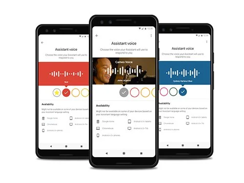
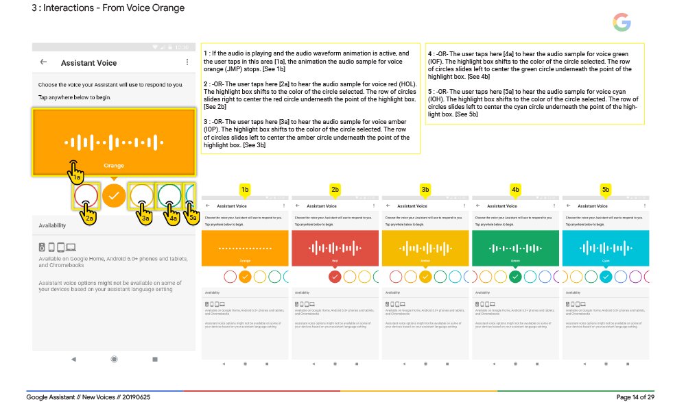
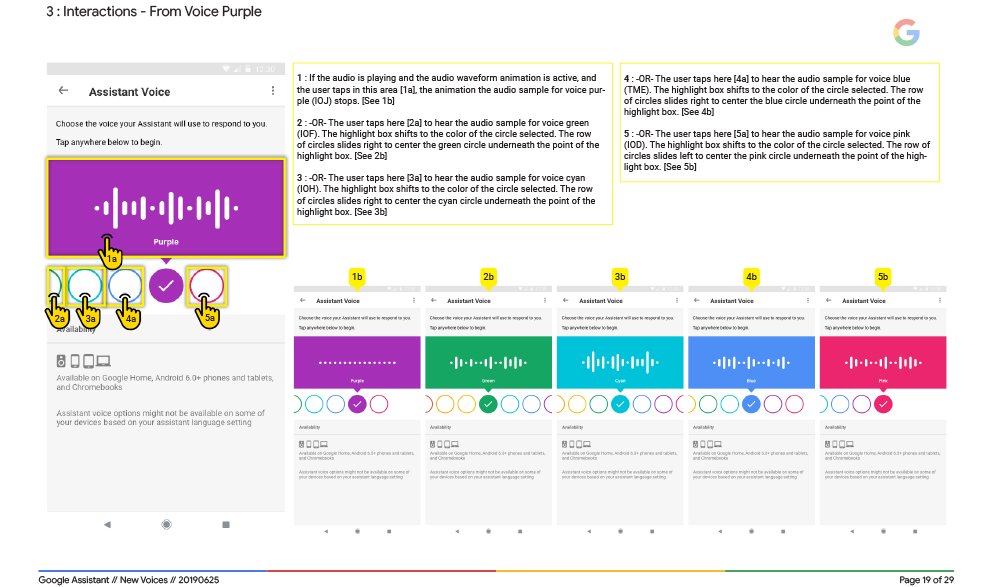
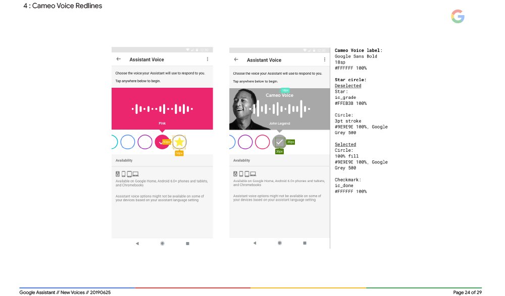
With the introduction of 6 new voice options for the Assistant, we created a fun, new, gender-inclusive UI for their voice picker located within settings.
the challenge
When Google asked the Assistant settings team to add six new voice options to the existing two for the Assistant, we encountered an interesting (and relevant) challenge.
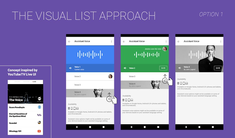
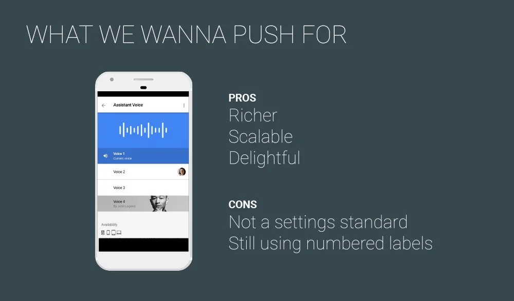
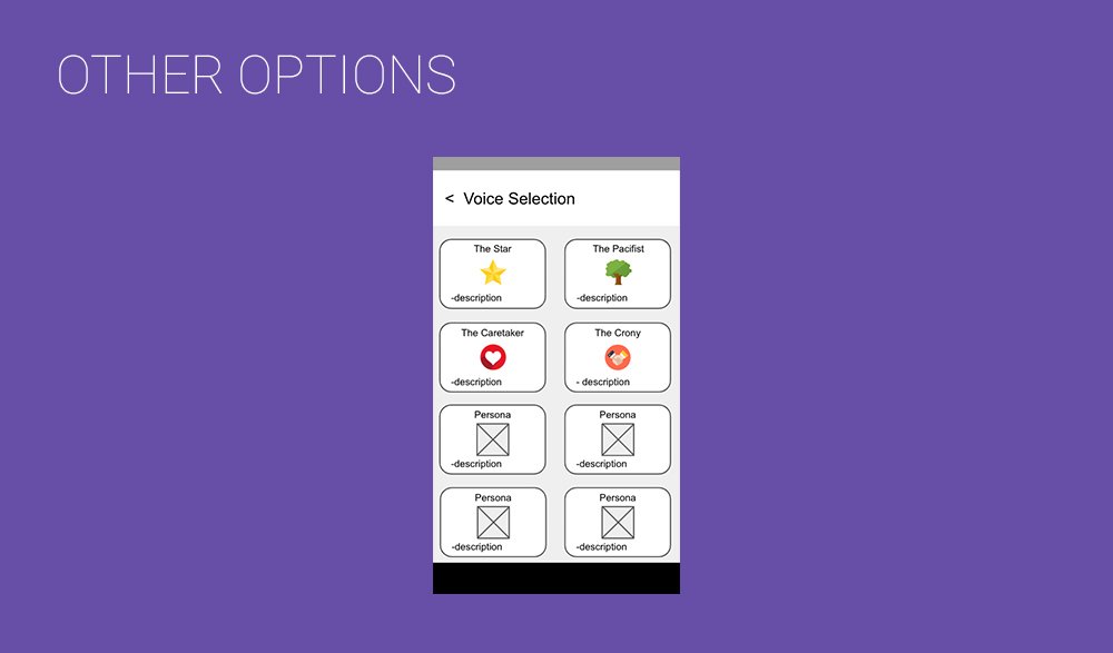
At the time, the two existing voices were listed plainly as "Voice 1" and "Voice 2." The easy decision would have been to add Voices 3 through 8 and then call it a day. We chose not to go that route, as it potentially would have caused scalability issues in the future. Since there is the likelihood of the addition of more voices and dialects, using this option would've meant users would've had to scroll through a long vertical list of arbitrary numbers. It's also boring.
The reason why numbers were used in the first place was to avoid the use of descriptors such as "male" and "female." We wanted to be inclusive of all genders, so using descriptors such as those were out of the question.
the idea
So how do you present 8 different options without the use of archaic and sexist descriptors? What can you attach to each of those options so when a user selects one and wants to share their selection with their friends or family, they have something they can reference?
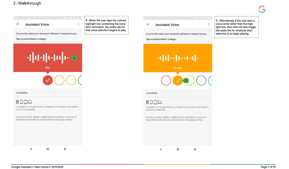
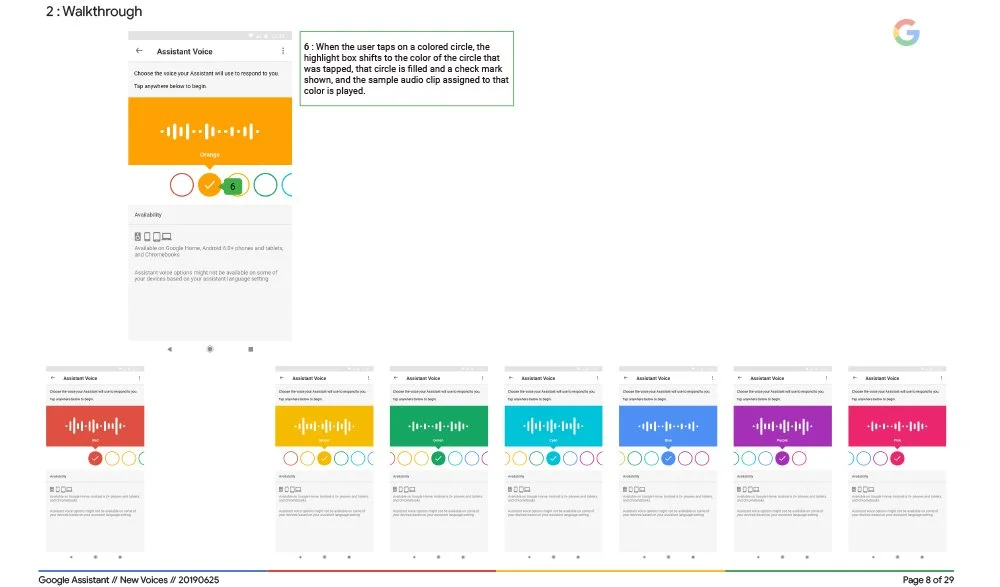
After many iterations we decided to use colors. Google's extended brand palette was extensive enough to be able to scale the design up to 20 selections (which is what we were told would be the max number of potential voice additions). This way, a user could tell others that they selected the "green" voice, and thus identify which voice they chose without being exclusive of nonbinary folks as well as without the use of subtly sexist descriptors that reinforce archaic gender stereotypes.
“Google is rolling out a new ui for choosing assistant voices, which are now named after colors”
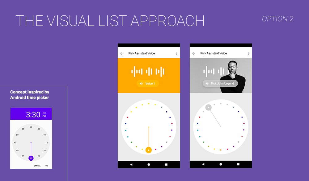
initial concepts
final handoff document

assistant settings redesign
The Assistant settings ecosystem was a bit of a mess. So I redesigned it.
the project
The Assistant settings interface was growing out of its original design. As time went on and more verticals were added, and more capabilities enabled, it was time for a UI and information architecture refresh. New verticals required new design components and paging structures that didn’t exist within the Assistant settings design system or in Google’s Material guidelines.
The settings ecosystem required its own design system, so I worked closely with designers from the Material team to create components that adhered to their already-existing ethos and structures and also satisfied the needs of the verticals teams, whose designers I also worked with in tandem. I also worked with the Google Home (now Nest) team to make sure that the designs aligned with the Home app infrastructure.
At the time we still used Sketch, and I created a Sketch sticker sheet that designers on verticals teams could use when designing the settings pages for their respective Assistant-enabled experiences.
final design handoff
project indigo
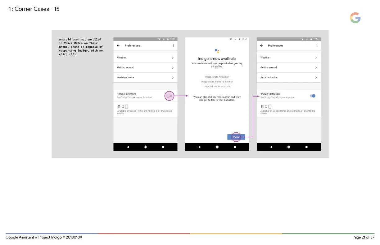
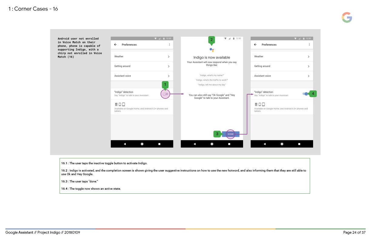
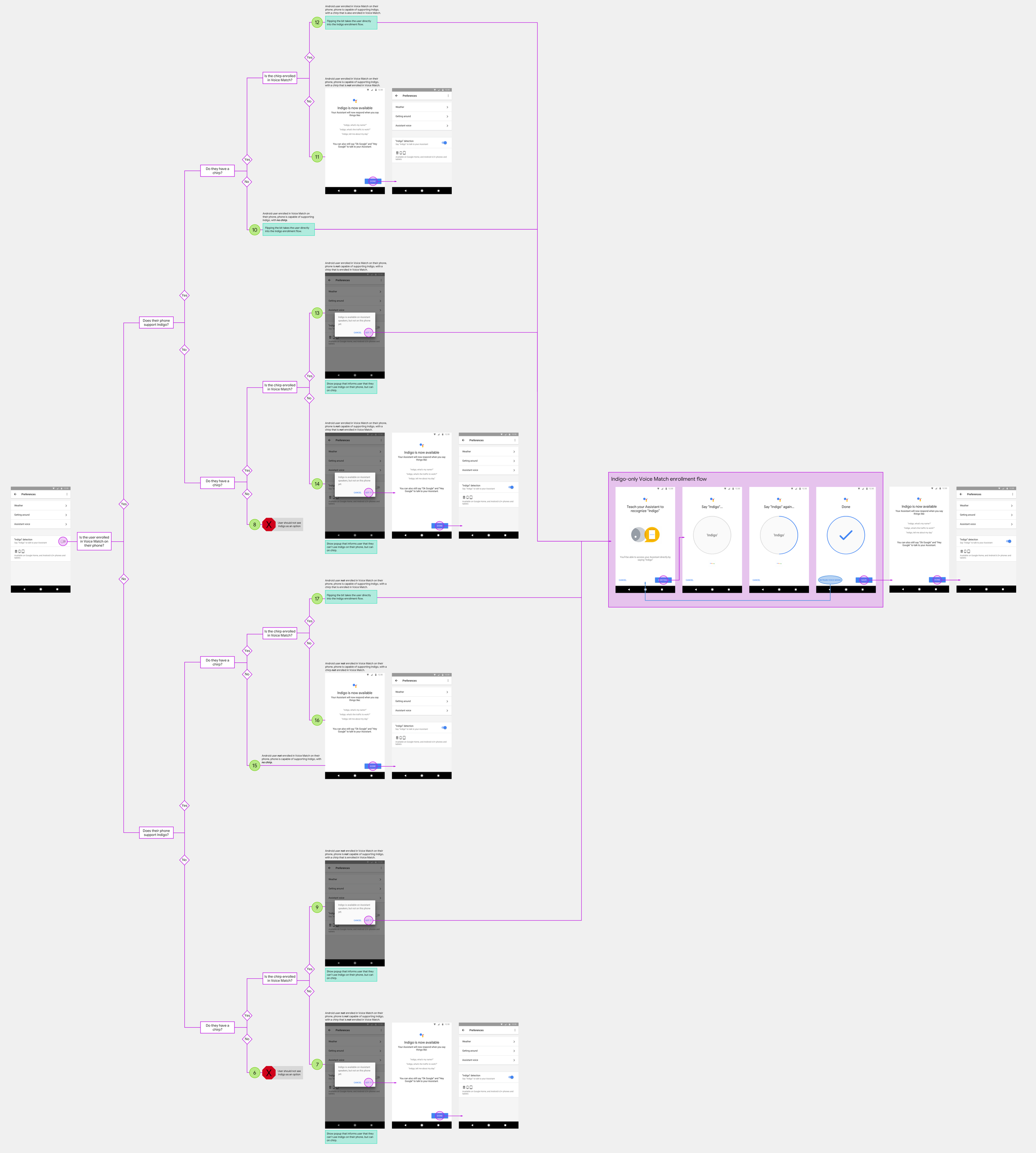
For a brief moment in time, Google explored adding a third wake word to the active the Assistant. I was in charge of designing the enrollment flow.
the problem
Back in 2017/2018 a team of linguists, researchers and conversation designers conducted a massive research study on the phonetic challenges surrounding the two wake words used to activate Google’s Assistant: OK and Hey Google.
A problem had been identified: OK and Hey Google are difficult to say, especially if the user is not a native English speaker. The “ay” sound in the letter K (or the word Hey) combined with the sound the letter G makes (the “guh” in Google) are “minimally different.” This means that when spoken, the sounds are created by the same tongue position in the mouth, making them difficult to say in succession, and even more difficult when followed with a sound that requires a dramatically different muscle movement, such as “oo”. The human brain uses muscles in the lips, tongue, jaw and larynx to organize sounds. It coordinates the articulation of speech by how those muscles need to move, and when words use similar muscles, that’s how you get tongue-twisters.
To put it plainly, the combination of the “ayg”+”oo” sounds in “OK Google” and “Hey Google” are unpleasant to say. In fact, they don’t exist anywhere within the English language, which is why it feels unpleasant to say. English-speaking speech muscles aren’t trained to make those two sounds in succession.
However! This is one of the reasons why these words were chosen- wake words need to be unique to the vernacular, meaning being comprised of word-sounds that aren’t used in everyday conversation. This is to prevent a voice-activated device from being activated repeatedly and unnecessarily while people are talking normally amongst themselves- not only would that require for it to be constantly running, it’s an insane amount of data to manage and would run up peoples’ power and internet bills, not to mention the crazy privacy issue it causes.
The devices are programmed to listen for and only activate when a predetermined set of uncommon word-sounds, called a wake word, is heard. The more uncommon the word-sound, the lower the chance of a misfire. The words Alexa, Siri, and OK/Hey Google incorporate phonetic sounds that aren’t commonly used in English vernacular (you can gauge this by trying to find words that rhyme) so their respective devices ONLY listen for that specific uncommon combination of word-sounds rather than listening in on all , thus solving the problem of a privacy barrier.
All three of the wake words mentioned are successful examples. The difference is, Alexa and Siri are pleasant to say, while OK/Hey Google are not.
So, one might ask, why force your users to have to experience unpleasantness of any magnitude? And the answer would be…branding. Executives really love the idea of people having to say their brand name repeatedly throughout the day, regardless of how unpleasant it feels for them.
the idea
The incredibly detailed and wildly fascinating research study on wake word linguistics done by human speech scientists and language experts concluded with a recommendation to add a third wake word to the Assistant lineup: Indigo. The question was, would executive management release their grip on the branding aspect and allow for a third word that didn’t include the name of the brand? The steps going forward would need to be taken with the utmost consideration for that in order to successfully convince the higher-ups that this was without a doubt in the best interest of their users.
the plan
Currently as the technology stands, a VUI (Assistant) requires a GUI (Assistant settings) to control and personalize a user’s system.
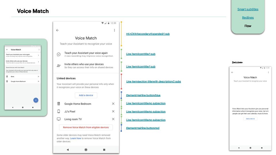
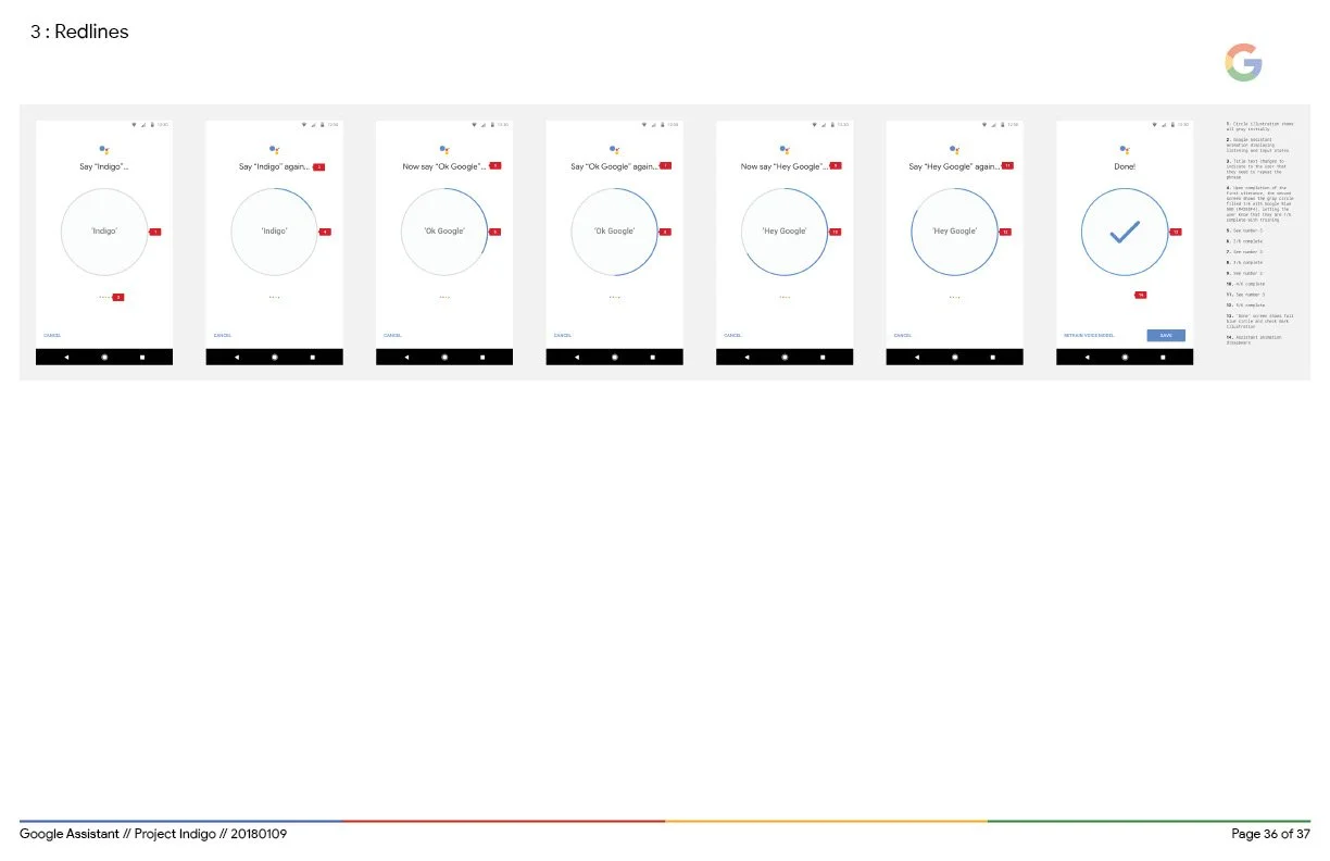
As 1 of 2 UX designers on the Assistant speech and settings team, I was in charge of the overall Assistant settings GUI, as well as the more specific domain of Voice Match, the technology used to identify and differentiate an individual user’s voice when they say OK/Hey Google in order to give them personalized results, which is useful in multi-user households. A user can “train” their Assistant to recognize their voice using a structured walk-through experience within their Assistant settings. The act of “training” involves repeating the wake words 3 times while the system records the unique combinations of intonation and pitch patterns of the user’s voice, creating a sort of vocal fingerprint
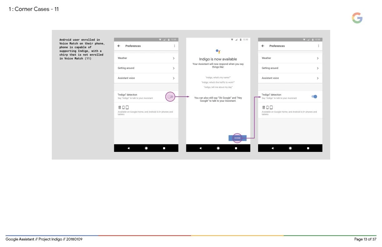
I used the Voice Match framework to give users the ability to activate Indigo within their systems and designed every aspect of how we would incorporate Indigo as a wake word while still maintaining the existing branding appeal.
Final design handoff
the result
Context clues have probably led you to the correct conclusion that this project did not end up in production. Project Indigo made it all the way to the executive management approval stage and was ultimately killed by none other than Sundar himself. The reasoning? That branding thing. Giving people Indigo meant they wouldn’t be saying OK/Hey Google anymore.
But hey, the plus side is I can brag that I had a project killed by the CEO of Google himself. That’s kinda cool, I guess!
