work done while at facebook
A.I. Tools and Platforms
Campus
Neighborhoods

a.i. tools and platforms
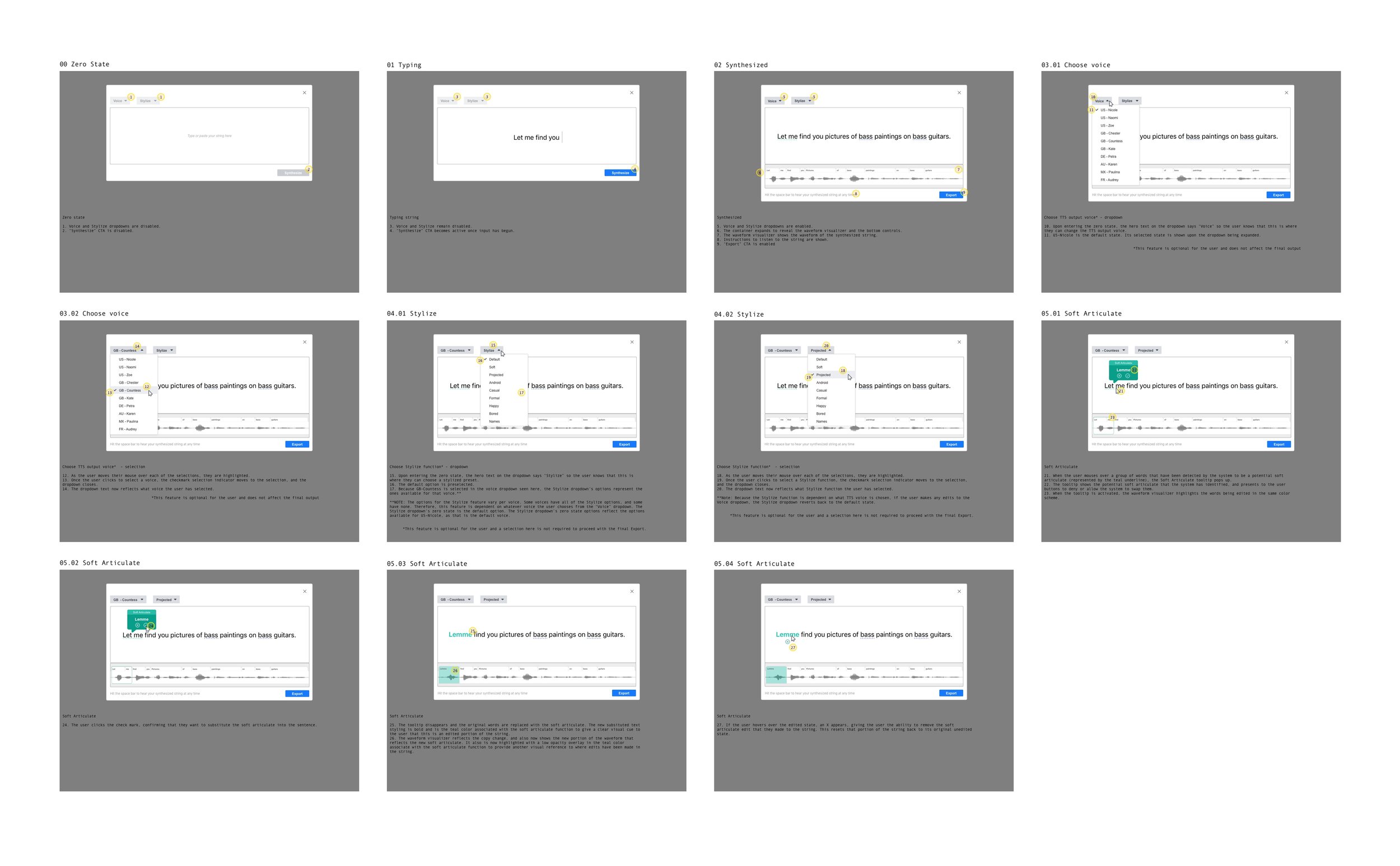
While on the A.I. Tools team I worked on a platform that would enable conversation designers to fine-tune linguistics while writing strings for TTS output.
overview
Talk-to-text A.I. systems (TTS) are built to synthesize human speech so when a user interacts with it, the system can reply in a natural way that makes sense to the user. The job of a conversation designer (CXD) is to anticipate ways in which an A.I. TTS can accomplish this. Each language contains its own variety of dialects, and within those dialects each contains its own linguistic anomalies that present their own challenges for TTS and for the CXDs writing the strings.
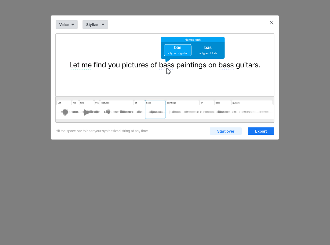
Oftentimes languages contain pauses, intonations, or emphases that have an impact on the meaning of what’s being said. The English language, for example, has words that are spelled the same but sound differently when spoken, or sound the same when spoken but spelled different, and all carry different meaning depending on the context of what’s being said. These are called homonyms and they are split into two main categories: homographs and homophones. A homograph refers to words that are written the same but have different pronunciations (like bass- the fish, and bass- the guitar). A homophone sounds the same but is spelled differently (there, they’re, their).
Spoken language also sometimes requires dialectal adjustments to increase the naturalness of how the system responds to the user. For example, when American English-speakers say the words “let me” they often soften the articulation of those two words separately into one (lemme). This is called a soft articulate.
Currently there are no ways for a TTS system to know when to apply these linguistic anomalies.
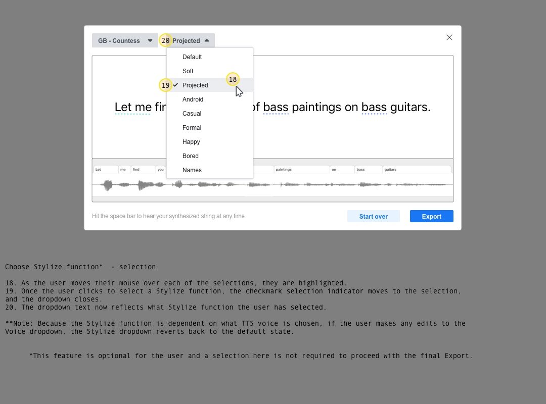
I was tasked with creating a GUI tool to give CXDs the ability to fine-tune how the TTS output sounds to optimize naturalness, context or style in TTS performances. CXDs can insert pauses, add intonation/emphasis, change pronunciations or invoke different speakers or speaking styles.
user journeys
walkthrough
interactive prototype

campus
I helped build out one of Facebook’s newest platform concepts catered to college students
overview
In an attempt to return to its roots, Facebook Campus was a space designed to give college students their own space away from the noise of the general Facebook feed. Modeled after the feed we all know, each university would get its own branded space accessible only by the appropriate .edu email addresses, and students would be able to create and have access to university-only spaces and connect with each other digitally, which was particularly appealing as the pandemic unfolded during this same time frame. Being sheltered in place and classes being online meant students were faced with being deprived of the robust social interactions that are so key to the college experience.
The Campus space utilized the familiar existing Facebook infrastructure but contained only campus-related content from the user’s university. Some key features were a campus directory where students could sort their schoolmates by graduation year, class ID number, hometown, housing, interests and more, campus-specific groups and events and a Campus profile where students could enter in their classes and receive access to class-specific groups and events.
My roles in this project were to take existing mobile designs and translate them into desktop-friendly versions using Facebook’s internal design guidelines, as well as leading the facet of the project called Minimally Complete Profile, which involved solving the problem of a student having an incomplete profile (which would negatively affect their overall experience).
As of March 2022, the project has been tabled.
Pr0ject highlights

neighborhoods
I worked as a product designer for another new Facebook platform called Neighborhoods
overview
Similar to Campus, Neighborhoods was another project I worked on that involved building a new Facebook ecosystem within the current one.
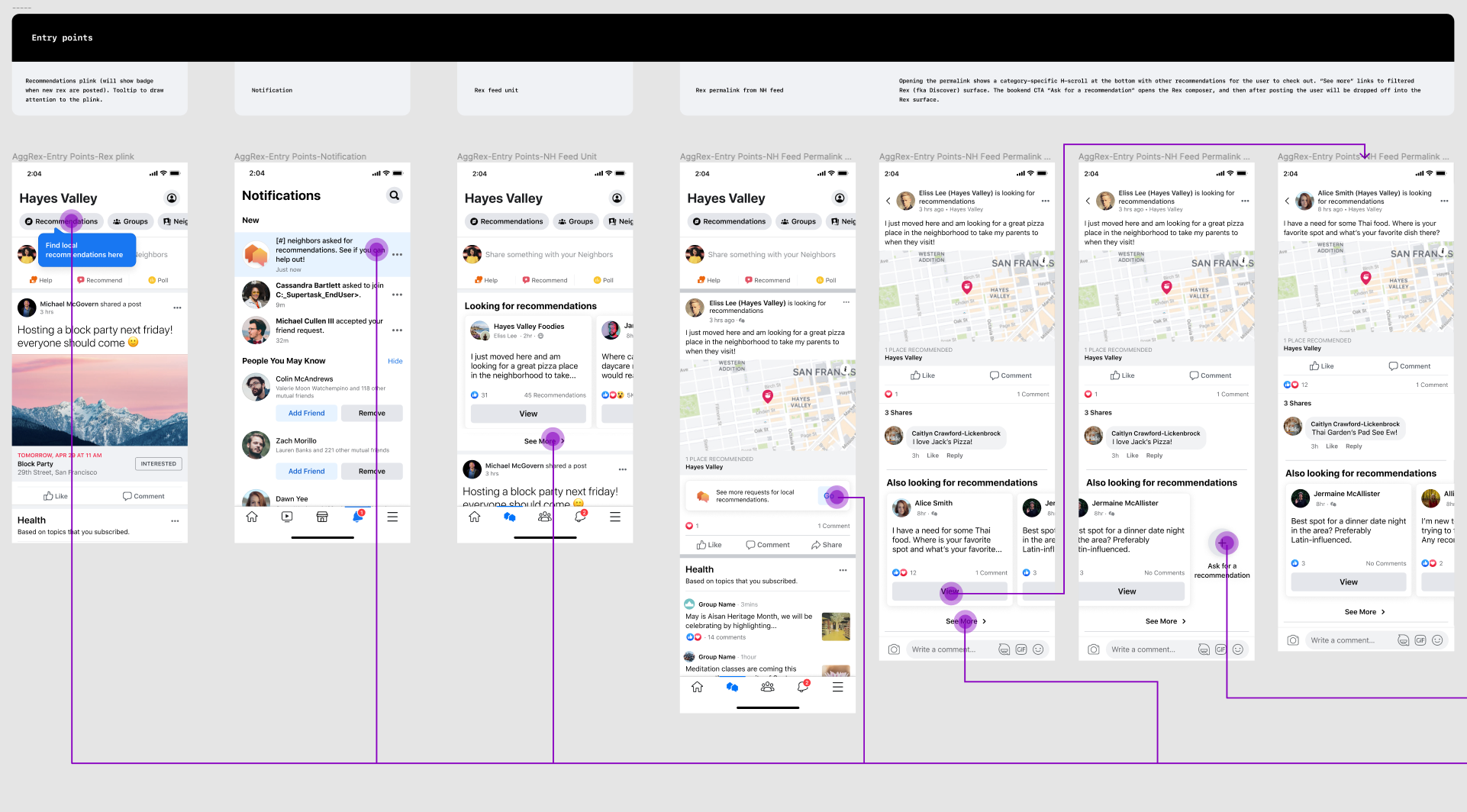
Aggregated recommendations: In numerous Neighborhood UX research studies, people said they would like an easier way to find recommendations. They often see a useful recommendation in their feed but then have no way to find that recommendation again or to discover more recommendations they may be interested in. People want to find out more about and discover new/well-liked small and local businesses and share and exchange relevant local information.
We aggregated all recommendations into the Discover surface so users can discover them in one place. We also included high-level categorization so neighbors can filter by category for recommendations they’re interested in.
By aggregating recommendations to one place, we provided more utility into Neighborhoods, which would bring people back to the surface when they want to discover local recommendations. Doing so gives users a clear mental model of where to ask for, give and find recommendations and will inspire them to engage with existing recommendations.


